Turn element data into color. A periodic table heatmap lets you visualize electronegativity, atomic radius, melting point, ionization energy, and more as instant color gradients. Learn how to read trends at a glance.
The periodic table is brilliant at organizing elements — but a static grid of numbers makes trends hard to see. A periodic table heatmap solves this by coloring every element tile according to a property value. Suddenly, the "why" behind chemistry becomes visible: electronegativity climbs toward the top-right, atomic radius swells toward the bottom-left, and melting points peak in the transition metal heartland. This guide explains how heatmaps work, which properties are most useful to visualize, and how to read color gradients like an expert.
What Is a Periodic Table Heatmap?
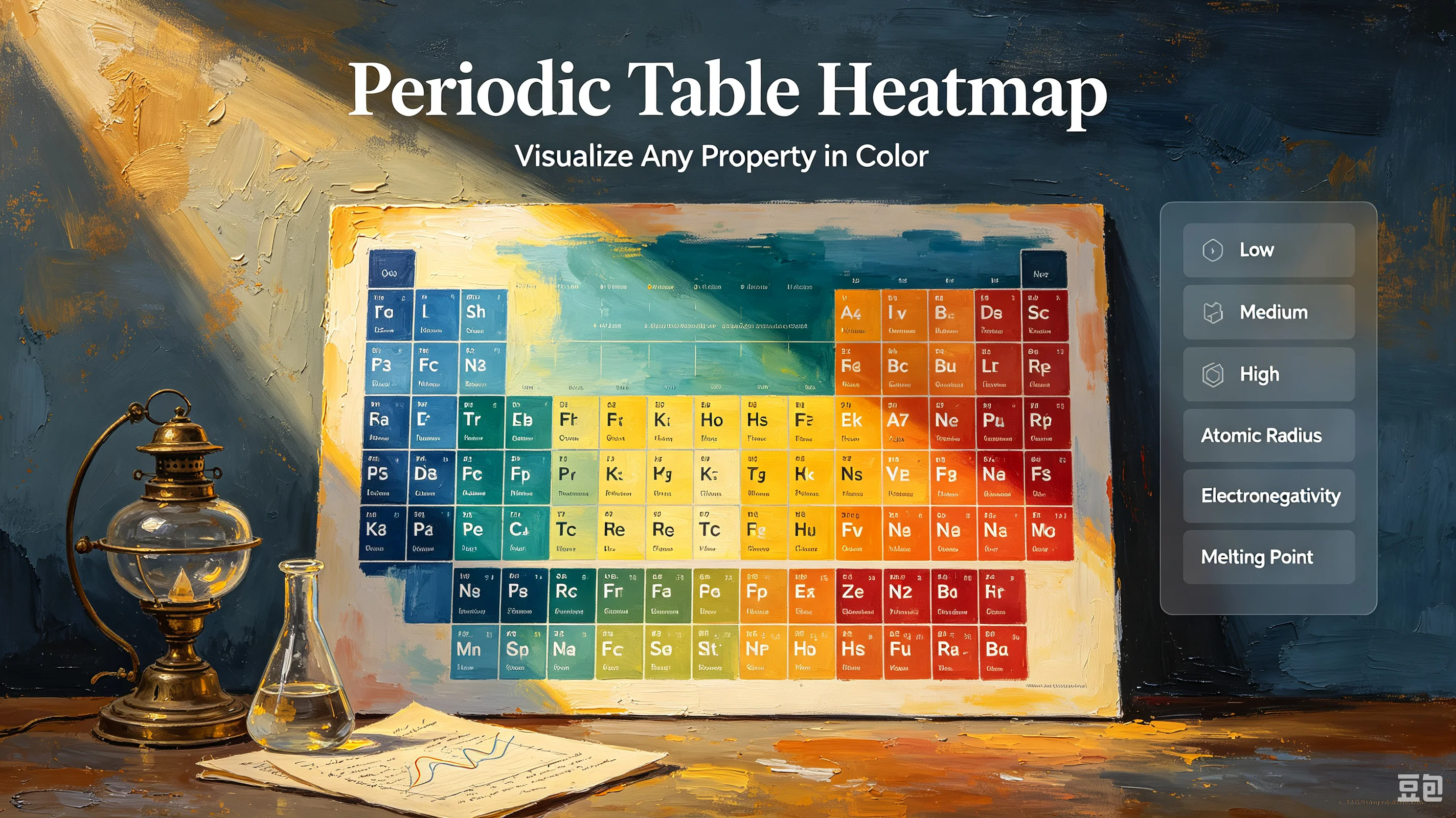
A heatmap is a color-coding system that shades each element based on a numerical property. The color scale maps directly to data: typically, warm colors (red, orange) represent high values and cool colors (blue, green) represent low values. Elements with no data or non-applicable properties appear neutral gray.
The result is a visual summary of 118 data points that your brain processes in under a second. Instead of scanning a table and mentally comparing numbers, you see the pattern immediately — including the exceptions.
The 6 Most Useful Heatmap Views
An interactive periodic table with heatmap support lets you switch between properties with one click. Here are the six views every chemistry student and researcher should know:
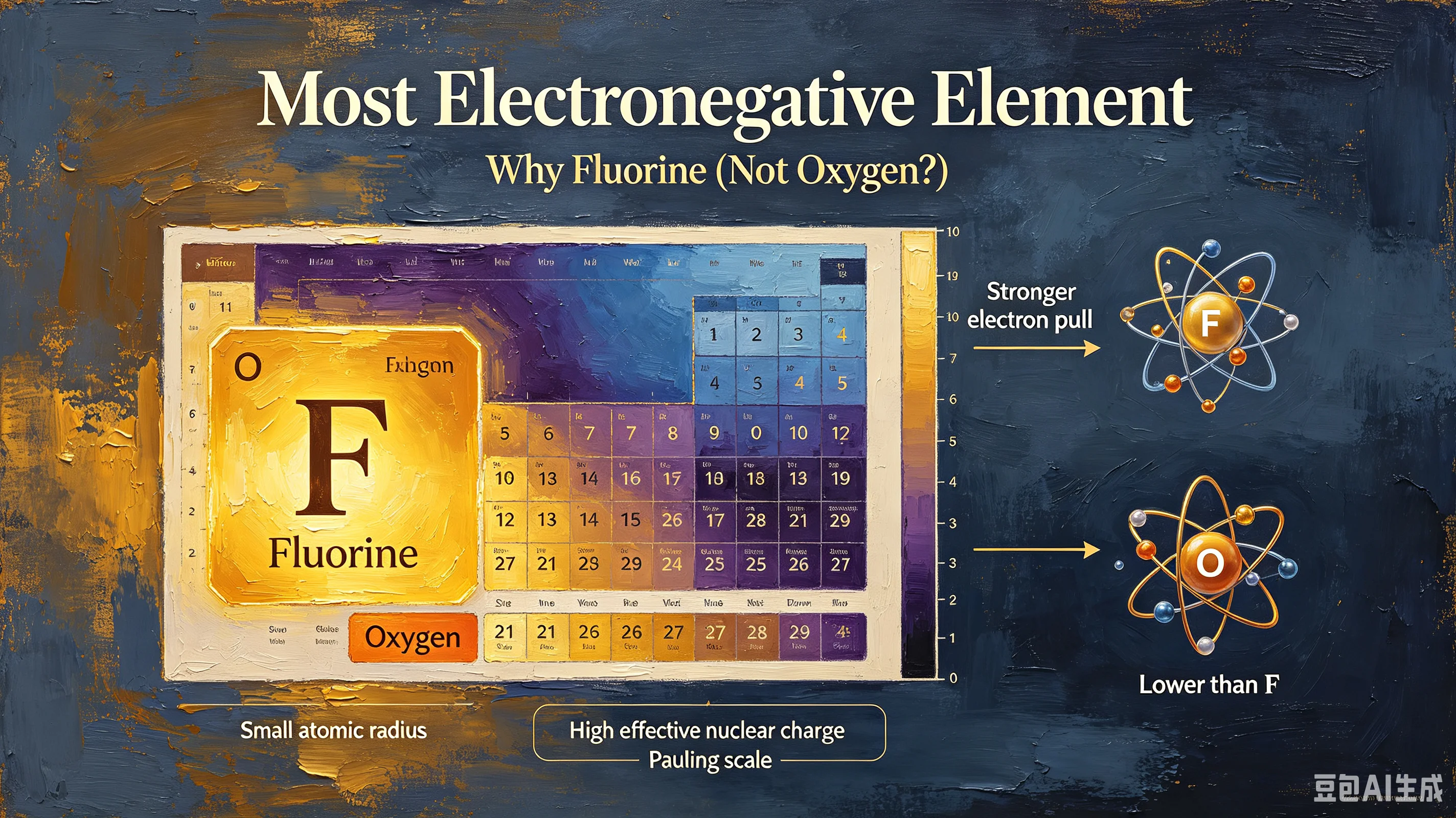
1. Electronegativity Heatmap The cleanest trend in all of chemistry. Fluorine (3.98) glows the warmest; francium (0.70) and cesium (0.79) are the coolest. The gradient rises diagonally from bottom-left to top-right, perfectly illustrating why fluorine steals electrons from everything and why alkali metals give them away. Use this view to predict bond polarity and ionic vs. covalent character.
2. Atomic Radius Heatmap The mirror image of electronegativity. Atomic size peaks at the bottom-left (francium is largest) and shrinks toward the top-right (helium is smallest). The color gradient makes the two rules obvious: radius decreases left-to-right (more protons pull electrons in) and increases top-to-bottom (new electron shells add distance).
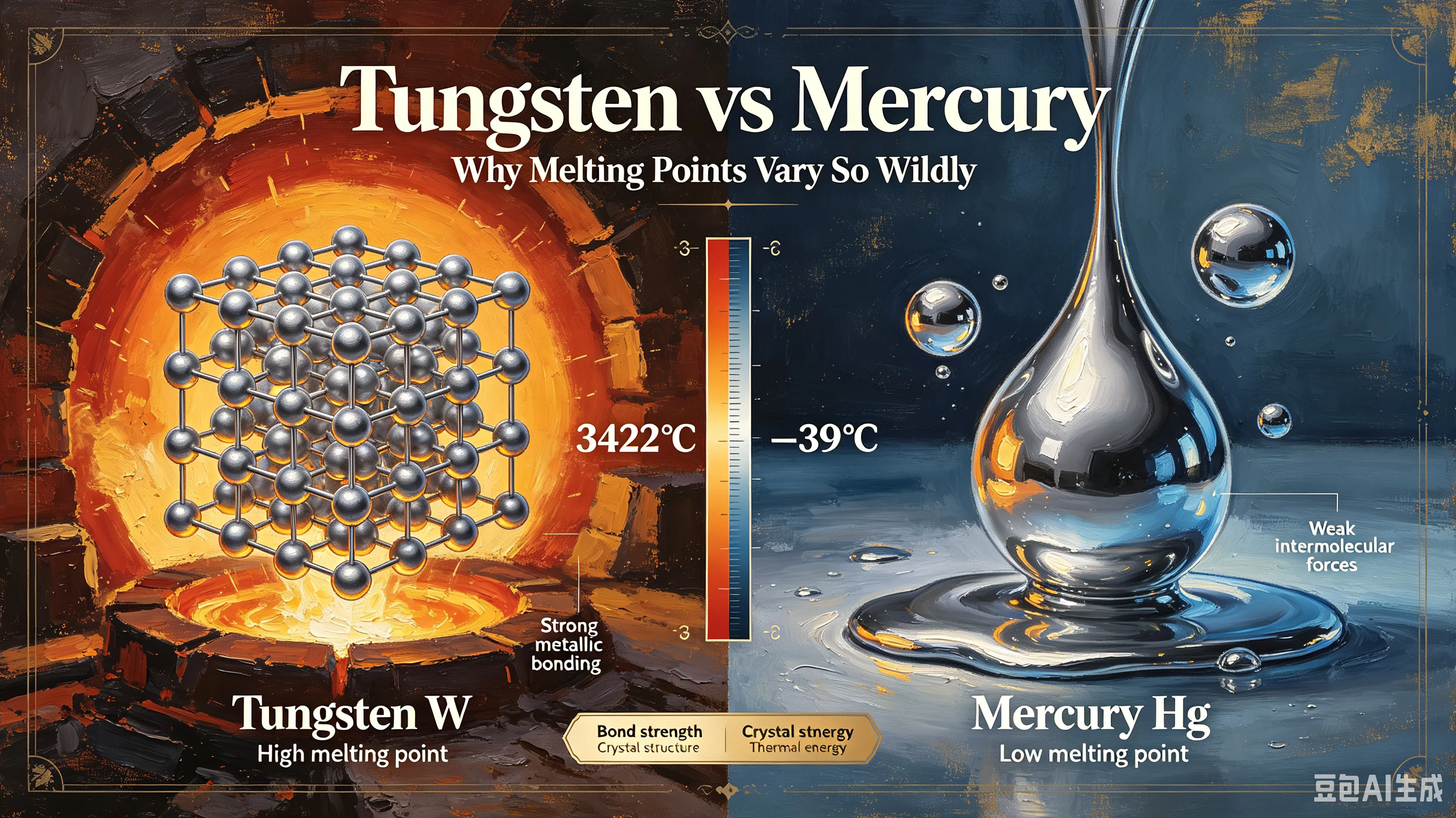
3. Melting Point Heatmap This view reveals bonding strength at a glance. The transition metal center — tungsten, rhenium, molybdenum — blazes warm with melting points above 2,600°C. The upper-right nonmetals and noble gases are icy blue, many below -200°C. Carbon (diamond) and boron are outliers: their covalent network lattices give them extremely high melting points despite being nonmetals.
4. Ionization Energy Heatmap Ionization energy (the energy to remove an electron) follows the same top-right trend as electronegativity — but with visible anomalies. Nitrogen sits warmer than oxygen (half-filled p-orbital stability), and beryllium beats boron. These dips and spikes are classic exam questions, and a heatmap makes them impossible to miss.
5. Density Heatmap Osmium and iridium dominate with densities above 22 g/cm³, glowing deep red in the lower transition metal region. Lightweight alkali metals and gases fade to pale blue. This view is invaluable for materials science — quickly identifying the heaviest and lightest solid elements.
6. Boiling Point Heatmap Closely related to melting point but not identical. Rhenium (5,596°C) and tungsten (5,555°C) lead, while helium (-268.9°C) is the ultimate low. The noble gas group shows a perfect downward gradient from radon to helium, demonstrating how van der Waals forces weaken as atoms get smaller.
How to Read a Heatmap: 3 Quick Rules
Rule 1: Follow the gradient, not individual colors. You don't need to memorize exact values. The direction and steepness of the color gradient tell you the trend. A smooth diagonal gradient means a consistent periodic rule; a patch of warm color surrounded by cool means an outlier worth investigating.
Rule 2: Look for anomalies first. The most interesting chemistry lives in the exceptions. In the ionization energy heatmap, the N > O and Be > B dips jump out visually. In the melting point heatmap, carbon's warm tile among cool nonmetals tells you something unusual is happening (covalent network bonding).
Rule 3: Compare two heatmaps side by side. Electronegativity and atomic radius are near-perfect inverses. Melting point and boiling point correlate but diverge for carbon (sublimes) and gallium (low melting, high boiling). Comparing views reveals relationships that a single chart hides.
Why Heatmaps Beat Static Tables
Static Table | Heatmap |
|---|---|
Requires mental comparison of 118 values | Pattern visible in 1 second |
Trends are abstract | Trends are spatial and memorable |
Anomalies hidden in rows | Anomalies pop out visually |
One property at a time | Switch properties with one click |
Hard to teach with | Ideal for lectures and self-study |
A student who studies an electronegativity heatmap for 30 seconds will retain the diagonal trend better than someone who reads a paragraph of text. Color encodes spatial memory — your brain remembers where the red was, not just what the number was.
Common Questions
Do all elements have data for every property? No. Some properties (like electronegativity) are undefined for noble gases that don't form bonds. Synthetic elements beyond uranium often lack measured values. These appear gray in the heatmap.
Can I use a heatmap to predict chemical behavior? Yes. Electronegativity heatmaps predict bond type, atomic radius heatmaps predict metallic character, and ionization energy heatmaps predict reactivity. The visual trend is often enough to make a reasonable prediction without looking up exact values.
What's the difference between a heatmap and a colored periodic table? A colored periodic table usually groups elements by category (alkali metal, halogen, etc.) with fixed colors. A heatmap uses a continuous color gradient tied to a numerical property — the shade encodes a value, not just a category.
Start Visualizing
Open the chembioTube Interactive Periodic Table and switch to heatmap mode. Click any property — electronegativity, atomic radius, melting point, ionization energy, density, boiling point — and watch the color gradient render instantly. Combine with the temperature slider to see how phase changes overlap with property trends. Free, no signup, runs in your browser.